Hey y’all, so I’m working on creating a more systematic way of designing in Figma (Essentially a design system). We’re only two designers but having a well-made modular system in place makes things much easier to design and is much more realistic when it comes to achieving parity between Figma and our front end.
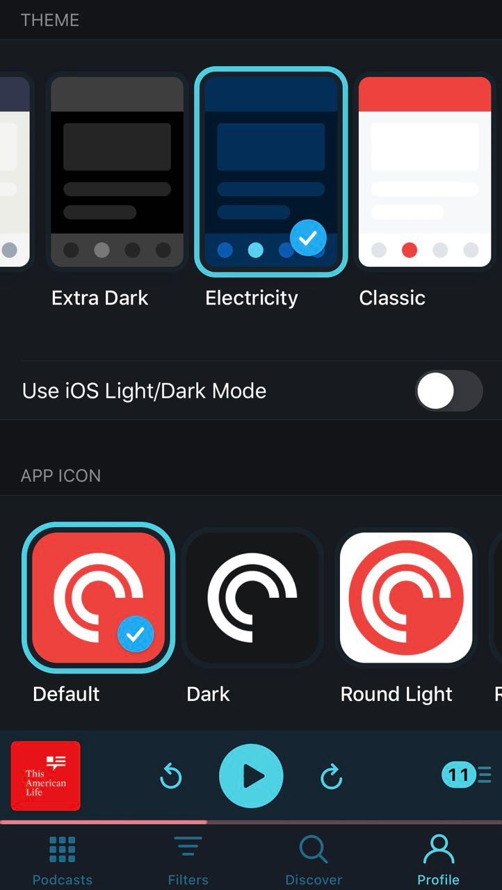
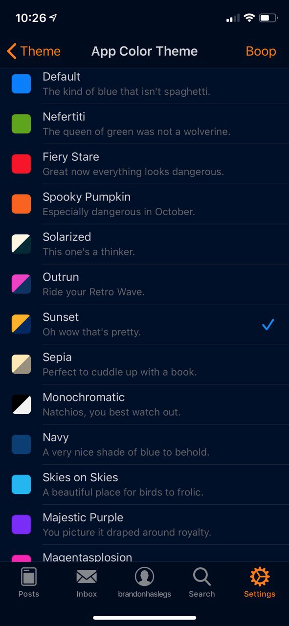
One thing I love from well-made apps is color theming. Most commonly this theming manifests itself as Dark Mode and Light Mode but it can manifest itself in more exciting ways. Look at how the Pocketcasts and Apollo apps do themes (below). Both apps also allow the user to change the app icon theme too. So fun!
So the first thing I’ve built out is a levels-based system of greys.
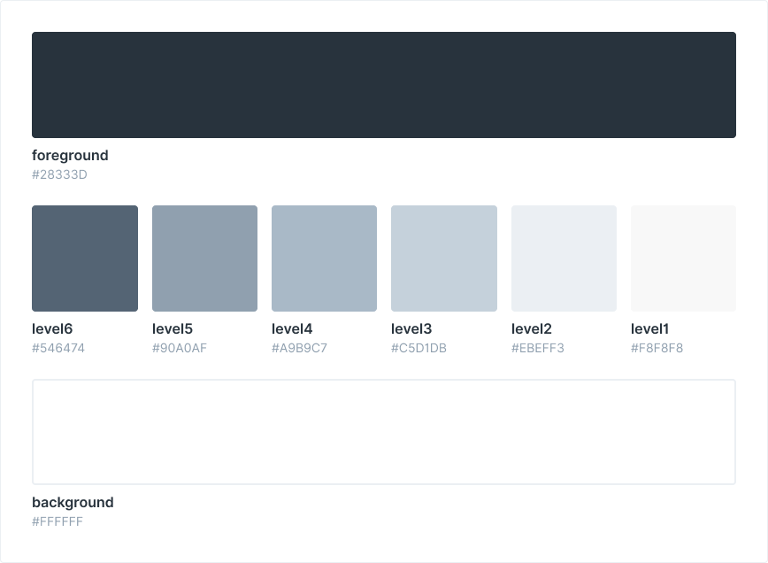
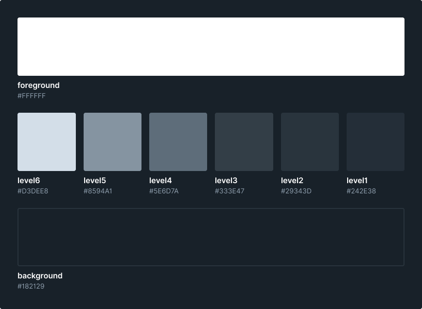
It was important not to use words like “dark” or “light” since those ideas go out the window when you switch to another theme. Here’s the naming I chose:
Background
The color that the interface sits on. In light mode, it’s normally white, or off-white.
Foreground
The color with the highest contrast against the background. (in light mode, it’s normally black or near-black).
Levels 1-6
Shades of grey connecting the Foreground and Background. This is not a purely mathematically interpolation between the background and foreground. I chose the values specifically for their use in interfaces.
 Help!
Help!
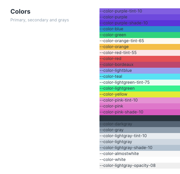
One thing I’m still kinda struggling with at the moment is deciding whether we adopt this full on 6-level system in the color set too. So far I just have the core colors (which don’t change between the two themes) and a Dark, Light, and ExtraLight variant of the core colors. Breaking my own rules here by calling them Dark Light and ExtraLight… Should probably just rename to Level 1, 2, and 3…
Anyway, do you think we need a full level system for the colors?
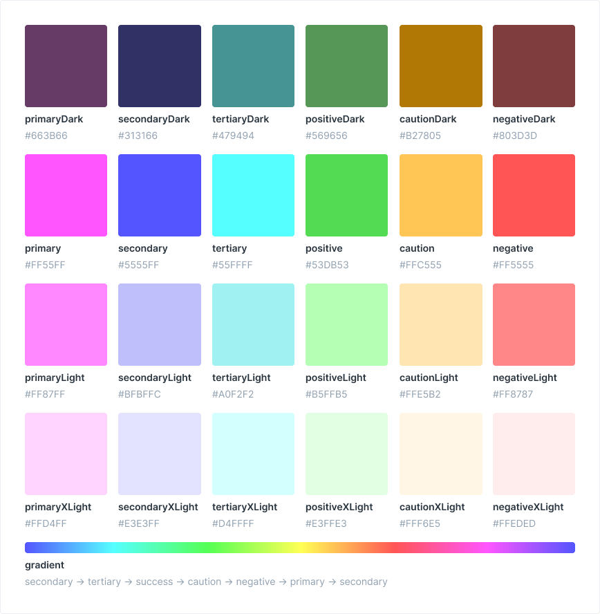
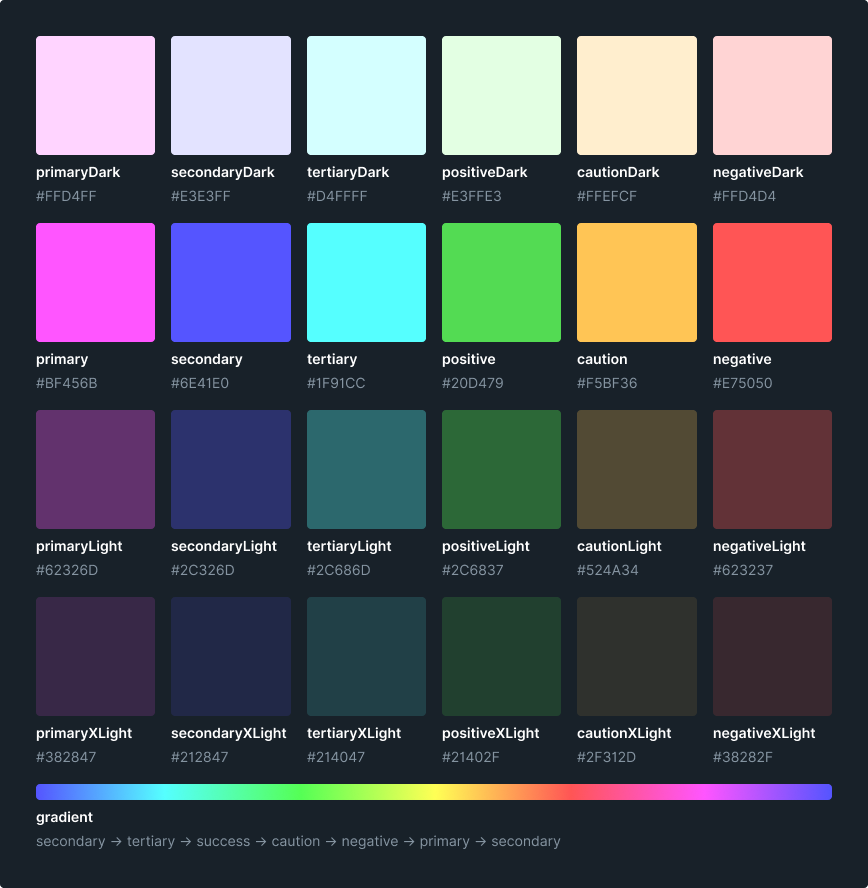
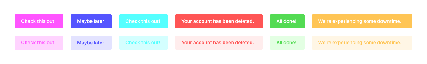
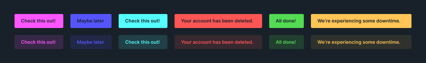
In my experience, I’ve only ever used one tint when designing interfaces. I think it’s not necessary to build in the full range of six levels that you have with greys. Mostly I just need a “faded” version of the color and the core color. For example:
Would love to know if, in your experience, you’ve come across the need to build in a full 6-level system for colors, or if that’s overkill.
One final note: If we build our Figma design system like this, and also build our front end on this system, then turning on Dark Mode, or app theming in general, will be much easier. I can imagine theming also existing on an org level similar to how Slack lets you change color themes from workspace to workspace. So not just app-level theming, but allowing the user to choose different themes for their different organizations.
Here’s my Figma file if you want to look at it a bit closer.
 But how many labels people use, I’m not sure
  Paging community rep
 I was working with Brandon on Grover’s design system previously.
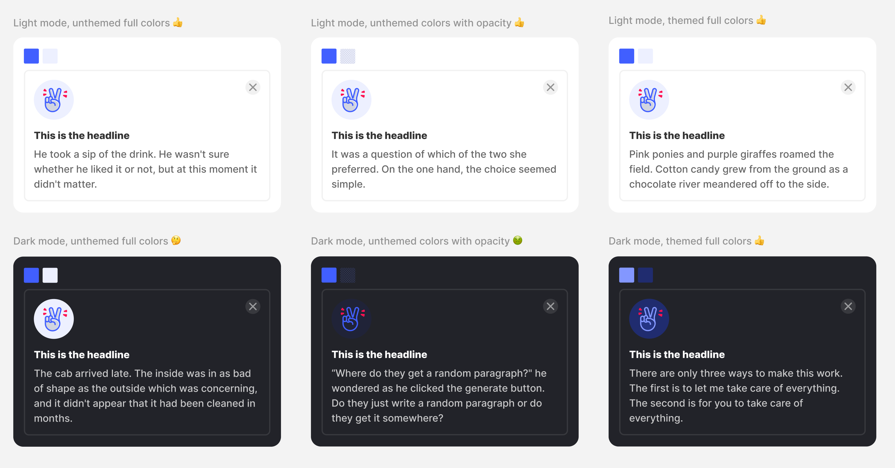