Hi Radicle Community! I posted this little write up on the journey we took to get the new Radicle brand and website on Twitter yesterday (thread here) but wanted to also post it here. Hope it gives some insight into the process behind the new look!
Check it out:
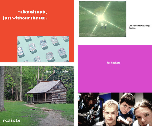
First, we started with a team BRAIN BLAST where everyone designed some Radicle posters. This helped us get a sense of what the brand was from those working on it (not just the designers). Could do a whole thread on this, it was really great (![]() to @lftherios for the idea).
to @lftherios for the idea).
After that I got to work coming up with 4 different visual concepts. Alongside this work, @abbey was wrangling cats (founders) working tirelessly on how to talk about Radicle. While they worked on brand strategy, I focused on the visual work.
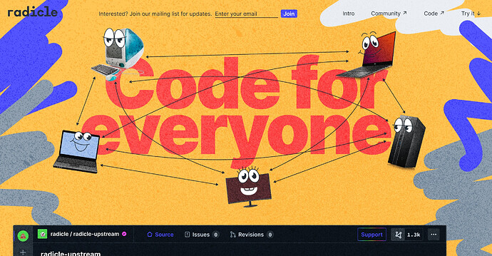
The first concept was supposed to be a natural extension of the the app. This direction reminds me of a vintage tech brand (90s Apple, NeXT, IBM) which seemed to vibe with Radicle, but in the end felt too normy. I spent way too much time drawing these illustrations…
The second was supposed to be sort of zine-themed. Balancing a zine aesthetic with nice serif typography was cool, but ultimately it felt a bit forced and the random p2p graphics didn’t really feel relevant.
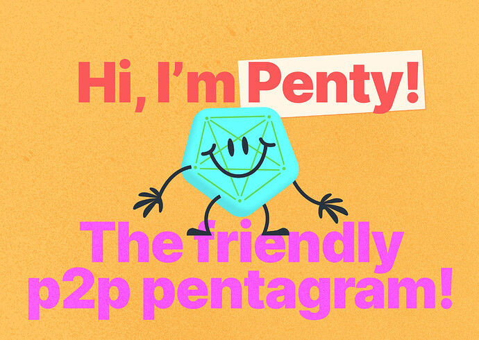
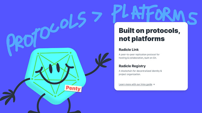
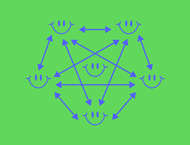
The third one really went hard on the “coding with friends” idea. I even developed a character (Penty the Friendly P2P Pentagram ![]()
![]() ) but honestly this direction felt way too childish … kind of like a code school for kids or something. I still think about Penty sometimes.
) but honestly this direction felt way too childish … kind of like a code school for kids or something. I still think about Penty sometimes. ![]()
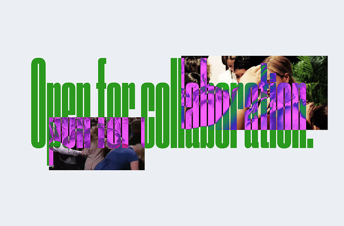
The last one was just bonkers. I am honestly crazy for this one. But uhh hear me out: what if Radicle was a cult. I might have watched too many documentaries on cults, not sure. Conceptually the idea is pretty awful. Cults are bad. But there was something there. Think cult status.
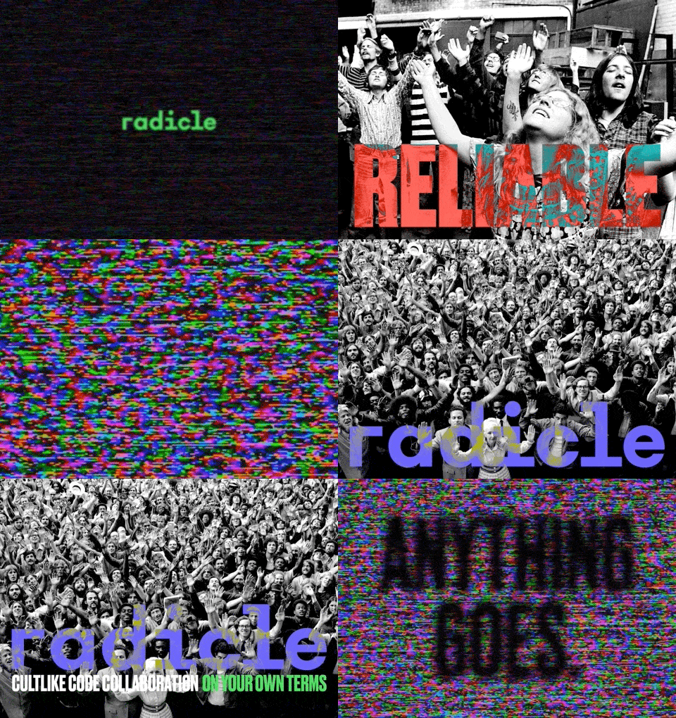
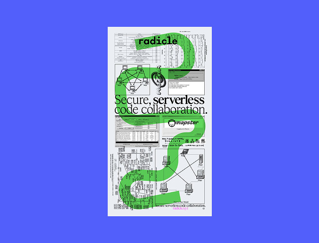
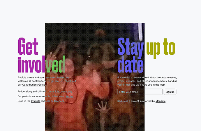
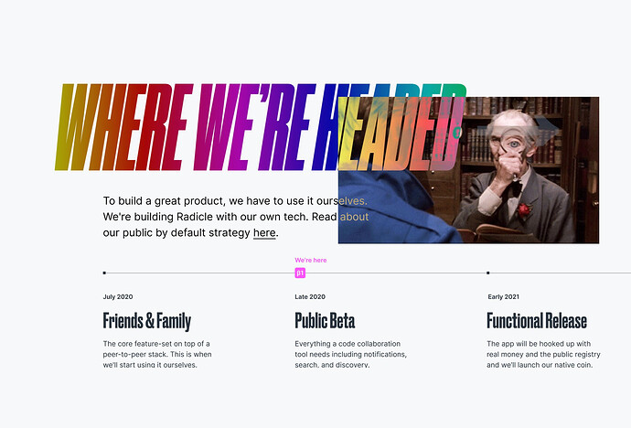
SO WE WENT WITH IT! I mean really, this direction felt the most honest and raw. Of course the imagery was awful and needed to change, but we’d figure it out! Swap cults for net art and GIFs and WE GOT A BRAND©®™.
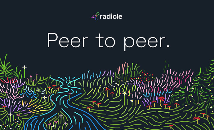
The end result feels home made and extremely online (even though Radicle is offline first ![]() ). With the swap to GIFs and net art we nailed the early web vibe that p2p so naturally pairs with. So that was fun, but then we had to actually design a website.
). With the swap to GIFs and net art we nailed the early web vibe that p2p so naturally pairs with. So that was fun, but then we had to actually design a website.
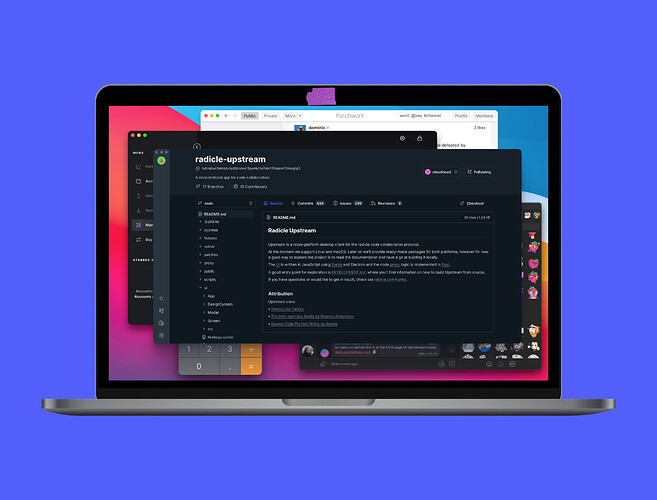
Once I really got into designing the site, some more fun things emerged. Showing a laptop with p2p and crypto apps gave some nice context to Radicle. The sticker covering the camera is ![]()
![]()
![]() … I see you, privacy nerds.
… I see you, privacy nerds.
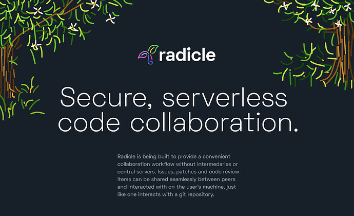
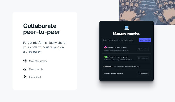
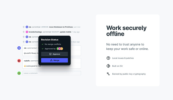
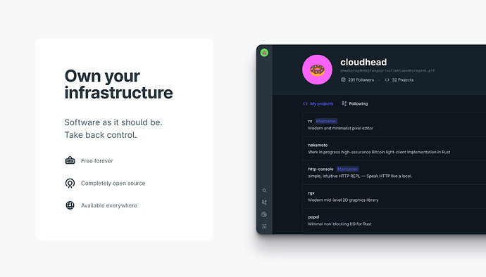
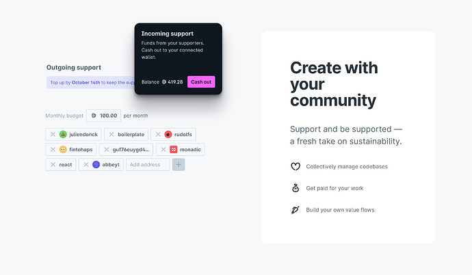
Also as a person who is pretty new to this world, I’m often annoyed at how CONFUSING everything sounds. So we wanted to explain the product in a super clear way. I hope that the final result does that. ![]() @abbey et al. really nailed the copy.
@abbey et al. really nailed the copy.
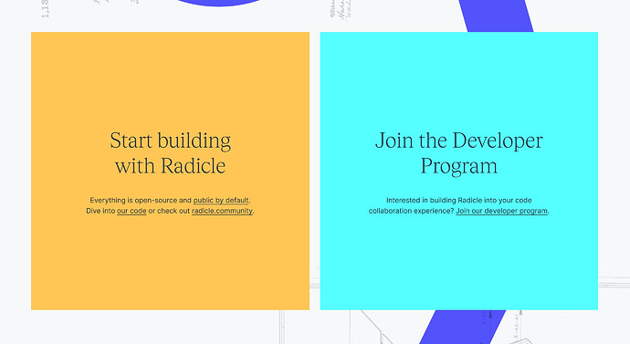
Anyway, if you want to see the final result, you’ll have to go to http://radicle.xyz ![]()
